ZIVA – The #1 App for Emergencies

ZIVA is the UX Design award-winning app for the Austrian Civil Protection Association. Empatic led the development of this civil-preparedness app, from the initial problem definition, all the way to bug testing and roll-out – and the launch straight to the #1 spot on the Austrian App store. Surprisingly, very little of our work was actually about screens.
Wednesday morning. On the screen is an app that does not actually exist yet. A Tirolean parent of two children clicks through a prototype of what will one day be known as “ZIVA”, but what is not only a mock-up. The most important screens have been designed, the buttons work, and the navigation can be explored.
Our core question is simple: How do you actually get started with emergency preparedness?
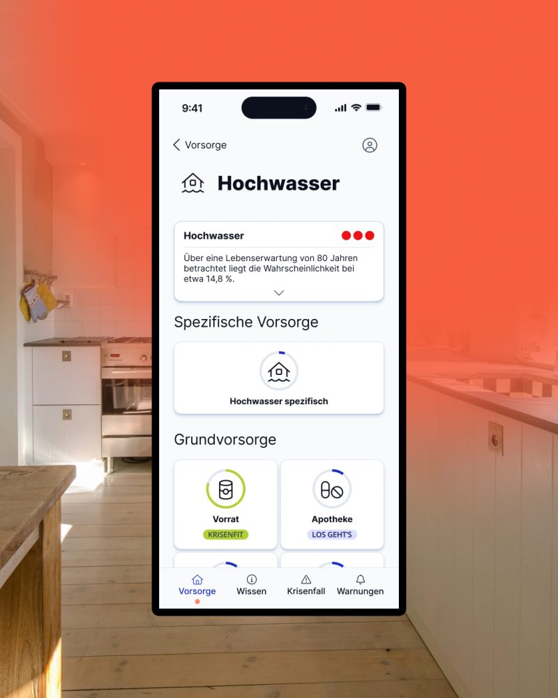
The answer turns out to break our entire design. Most people have no idea what “basic preparedness” is, but a blackout, on the other hand, is clear. So is flooding. Or being stuck inside your home, unable to leave, for several days.
In our meetings and workshops, “basic preparedness” was a perfectly clear concept to build the design around. For users, it was completely foreign. This is the uncomfortable side of UX: you discover that what you find obvious is only obvious to you.
For ZIVA, this discovery changed how people enter the app: Instead of beginning with an abstract concept, the app starts right away with specific risks. And behind this, lies a broader insight: people rarely behave the way organizations assume they should.

The Human Being as the Unknown Variable
With ZIVA, the Austrian Civil Protection Association wanted to create an application that analyzes risks, provides real-time warnings, and offers concrete recommendations for personal preparedness. More than 100 emergency organizations, public authorities, and companies were involved in its development. We had no shortage of expertise around hazards, warning systems, and preparedness measures.
But we were missing an understanding of how a real person deals with all of this information.
So we did not start with the interface. We started with research. Several thousand people across Austria took part in a quantitative research study, followed by interviews with representative people from specific target groups: cities vs. rural areas, apartments vs. houses, people who are prepared vs. “I have never thought about emergency preparedness at all.”
We quickly realized that the term “users” was not especially helpful. One person already has a complete emergency kit at home. Another trusts that the government will take care of whatever happens. A third would like to prepare but has no idea where to begin. Once you put on the shoes of those three people, it becomes difficult to keep talking about the same app for everyone.
But the real challenge was not the people who were already prepared. The more important group was those who had barely engaged with the topic at all. That changed the question from “How can we explain emergency preparedness as clearly as possible?” to “Why should someone engage with emergency preparedness in the first place?”
When Research Gets Uncomfortable
In many digital projects, the solution is decided surprisingly early. Subject matter experts understand the topic, technology opens up (or closes off) possibilities, and at some point design is expected to turn everything into an understandable interface.
When you come up with a solution first, you tend to spend a lot of time defending it. User research can quickly become a way of confirming what you already believe. You show people a polished concept and ask whether they like it. You collect a few comments, change a couple of button labels, and move on to development.
The interesting thing about user testing when it’s done right is that people do not tell you what you want to hear. They simply click on whatever seems right to them. When someone is sitting in front of your prototype and does not understand something you thought was completely obvious, there is not much room for argument. You have to change your assumptions.
This is the ultimate value of user research. Good research does not necessarily confirm your idea. Sometimes it destroys it.
Our team also had to rethink what simplification really means. Shorter text, reducing technical terms, and fewer decisions sound like obvious goals. But with civil protection information, simplification itself can become a problem. If I simplify an explanation of earthquake risk so much that everyone understands it, I risk that nobody understands what it actually means in practice. I may have improved comprehension but removed the quality information I wanted to share.
Good UX does not mean making everything as simple as possible. It means presenting information in a way that people can understand, and be able to interpret it correctly.

Accessibility Does Not Start with Contrast Ratios
The challenges of communicating information became especially clear when we looked at accessibility. ZIVA is intended for the entire population, so it has to work for people with very different needs and abilities. Contrast, font sizes, usability, and screen reader compatibility are all part of that. But they are only the beginning.
Our team therefore also tested the application with a blind participant. It quickly became clear that simply reading out the visible interface in the same order was not enough. Suddenly, the issue was no longer just contrast ratios, font sizes, or screen reader compatibility. The more fundamental question was: How should information be structured when someone experiences it in a completely different modality than I do?
Language can also be a barrier. A term that feels completely natural inside a specialist organization can be meaningless to everyone else. Information can be correct and complete and still fail to trigger any action.
Zoë, a designer at Empatic, summed it up very well: “We constantly had to find the balance between technical accuracy and genuine comprehension. Not everything that sounds precise to experts is helpful to someone who simply wants to know: What should I do right now?“
Nobody Wants to Use an App
Perhaps that is also one of the misunderstandings around user experience. Most people do not want to navigate an information architecture as elegantly as possible. Nor are they looking to experience a particularly beautiful interface. They want to get something done. They want to know whether flooding could affect where they live, what they need at home during a blackout, or what a national warning means for their house and family.
The app is only the means to an end.
That is why ZIVA was not conceived as a collection of civil protection information, but as an application that translates that information into a personal tool: Which risks affect where I live? What can I do? What should I prepare for?
Personalization means more than displaying someone’s name somewhere. A product needs to understand which information matters to which person at which moment.
Design Does Not End in Figma
Empatic supported ZIVA from problem definition through research, concept development, and design all the way into technical implementation with their development partner CBP. The development itself was carried out by the CBP team.
After all, there is a lot of reality between a prototype and a functioning app: technical constraints, interfaces, content, different organizations, and decisions that suddenly look very different in implementation than they did in the design file.
Much of that is invisible in the finished product. You do not see the interview that caused an assumption to be discarded. You do not see the test in which a supposedly obvious term failed. You do not see the discussion about whether a piece of information can be understandable, technically accurate, and accessible at the same time.
Good design leaves very few traces of how it came into being.
Then the App Reaches Number One
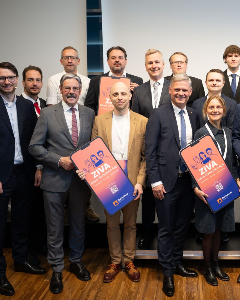
Today, ZIVA is the number one in the Austrian App Store and won the UX Design Award in the “Product” category – with a special jury selection. The application has been covered by the media, with particular attention given to its accessibility and features for people with disabilities.
Of course, we were happy to see ZIVA in the number one spot and get our UX Design Award. But for me, the more interesting question is another one: Did someone put one more container of drinking water at home today because of ZIVA?
A user-centered mindset does not mean taking expert knowledge less seriously. It means knowing when expert knowledge alone is not enough. The civil protection expert knows how to prepare for a crisis. The developer knows what is technically possible. The designer knows how information can be structured.
But none of them automatically knows how someone feels when they suddenly come across the term “basic preparedness”.
You have to ask that person.
And sometimes you have to silently watch them struggle to find the button.
Perhaps that is the least spectacular side of user experience. And at the same time, the most important one: you do not start with your own answer. You start with a willingness to ask the question, again.
For ZIVA, the decisive questions eventually became not only what a civil protection app should look like, but what information do people need in order to engage with their own preparedness in the first place.